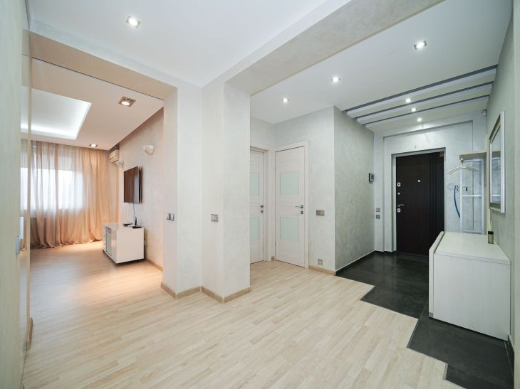
Creating a feeling of spaciousness in a cramped space is a difficult task, but it is entirely doable.
It is possible to visually expand the boundaries by using a number of tricks and techniques. The magic of optical illusions opens the way to visually expanding the walls.
Light colors and mirrors
Reflective surfaces are the key to deceiving the eye. Well-placed mirrors create the effect of endless space. Walls painted in pastel shades visually recede, making the room airier. Light colors reflect light better, visually expanding the boundaries, says Yulia Tychino .
The use of glossy furniture and decorative items is a technique that enhances the feeling of freedom and lightness.
Reflections on smooth surfaces seem to invite the gaze to travel further, overcoming the cramped space.

Horizontal lines and patterns
Strict horizontal lines in finishing, furniture or decor can visually stretch the space in width.
Wallpaper with a horizontal pattern, tiles with horizontal layout, wide skirting boards - all these elements will create the illusion of space.
But when using this technique, harmony is important: too many lines can lead to the opposite effect - the room will seem even narrower. Reasonable restraint and a sense of proportion are the key to success.
Minimalism and the right light
Refusal of excessive furniture and decor allows the space to visually expand. The freer the zone, the wider it seems. The bet on laconic minimalism is not only fashionable, but also practical in a small apartment.
In addition to furniture, it is necessary to think about lighting. Even distribution of light sources throughout the entire area of the room allows you to visually expand the boundaries. Illuminated niches and shelves make the interior deeper. The technique of light ceilings also contributes to the optical increase in the height of the room.
Unity of colors and textures
Smooth transitions between colors and textures allow the eye to move freely around the room. Sharp contrasts and contours are undesirable - soft gradients and tonal stretches are preferable. Natural materials are more harmonious than artificial ones.
Using similar textures for finishing walls, floors and furniture will create a sense of integrity and indivisibility of space. Bold accents should be used with caution.
Beyond the Limits
Tight boundaries can awaken creative thought. The desire to overcome boundaries involuntarily gives rise to creative ideas, non-standard and even paradoxical solutions.
Sometimes it is worth breaking patterns and established canons to give a new sound to the familiar. An unconventional approach to zoning, planning or even opening up new perspectives - everything is possible when thinking is free from shackles.
Narrow rooms present a unique challenge to the designer, calling to go beyond the limits. And those who dare to answer the call will be amazed to discover that the visual expansion of space is only the tip of the iceberg, hiding inexhaustible potential for creativity.
Earlier we reported on the design of an apartment in the Provence style .


