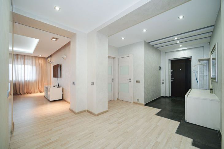
Worst Decisions: 3 Common Mistakes in Using White in Interior Design
White is considered a universal color and is therefore often used in interior design.
However, if used incorrectly, this color can ruin the interior.
Interior design and interior design expert Yulia Tychino explained what mistakes should be avoided in such a case.
Leave white everywhere
It so happens that often in rooms some elements are painted white as standard.
This applies, for example, to window sills, window slopes, radiators and ceilings.

However, it is quite possible to move away from this classic. Moreover, some solutions will then look more advantageous.
For example, if the ceiling is even partially painted the same color as the walls, it will appear higher.
In addition, you can choose a bright frame or slopes for the window. This solution will help make the interior more interesting.
Radiators and switches will not look like a white patch if they are painted in a different color.
Don't match lighting and shades
White can be a different color, so it is important to consider the lighting in the room when using it.
If there is enough of it, you can choose cool shades.
But if there is not enough natural light, it is better to choose warm tones.
Use different surfaces
You shouldn't try to combine matte and glossy white surfaces in the interior. After all, they have a completely different effect.
Glossy surfaces reflect light, making the room brighter and more spacious.
Matte ones, on the contrary, can absorb it, and therefore appear more muted.
Earlier we wrote about the rules of color combinations in the interior.
