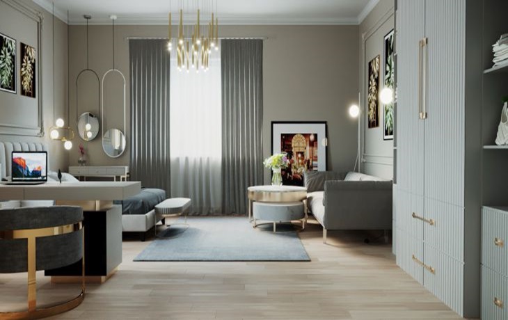
It looks beautiful in the photo, but in reality it’s a real nightmare: why popular design techniques don’t work
When trying to replicate a popular design technique, it is worth remembering one important rule.
If you don’t take this into account, the design trick will not only not work, but will also ruin the space of the home.
A comment on this topic was shared by the expert of the online publication TUT NOVOSTI, designer Yulia Tychino.
Zoning of premises
This is a popular tip that helps create multiple zones within a very limited space. For example, create a bedroom and a study at the same time, or divide a bedroom into two.
This recommendation will not work if the room is narrow. You will get tiny nooks with negative ergonomics.

Zoning is ideal for corner apartments with several windows. Square rooms with an area of at least 15 sq. m. are best divided.
Visual expansion of space
There are a great many tips on how to turn a one-room apartment into a three-room mansion.
For example, it is recommended to use furniture with glass and glossy facades.
The idea is that they reflect light and thus create the illusion of space.
Why doesn't this technique work? Too much glass in a small space makes it visually cluttered. The eye is drawn to several accent points at once.
Or, for example, a glossy kitchen façade may be a bad choice if the windows face the sunny side. Sun glare may become a nuisance for the apartment's residents.
You can use glass and glossy surfaces, but it is important not to overdo it, otherwise in reality the effect will be the opposite.
