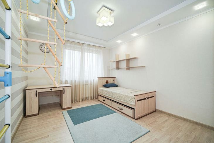
Children's interior: how to make it bright, but not overloaded with colors
When decorating a children's interior, it is important to find a balance between brightness and conciseness.
You can create a truly attractive, yet uncluttered space by following a few important principles.
Let's start with the color palette. Give preference to a combination of no more than 3-4 main colors. This will help avoid the feeling of oversaturation, says Yulia Tychino, an expert at the online publication "TUT NEWS".
Choose one or two bright, accent shades and complement them with neutral, calm tones. For example, bright blue combined with white and gray, or rich green with beige and mustard.
To avoid overloading the interior of a child’s room, use bright colors in specific places – in the form of textiles, accessories, and small pieces of furniture.

Make them accents that will set the tone for the entire space. And decorate the main surfaces - walls, floors, large pieces of furniture - in softer, neutral tones.
When choosing a color palette, focus on the child's age. For babies, it is better to use calmer, pastel shades - delicate blue, pink, green.
For preschoolers and younger schoolchildren, more saturated, cheerful colors are suitable - blue, red, yellow. And for teenagers, it is worth choosing more restrained, adult palettes.
The key element of a bright, but moderate interior is the correct choice of lighting.
Combine general lighting in the form of chandeliers or ceiling lamps with local lighting - table lamps, sconces, backlighting.
This will create the necessary atmosphere and zoning of the space. Lamps with adjustable brightness and color temperature will help adjust the lighting depending on the child's activity.
To add bright accents, use textiles - curtains, pillows, bedspreads. They can be in contrasting, saturated shades, but at the same time not overload the space.
Modular rugs with geometric or abstract prints will also be effective. They will liven up a neutral floor without overloading the interior.
The walls deserve special attention. They can be decorated with bright posters, paintings, stickers. But do it moderately, concentrating accents in separate zones. This way you will emphasize the main functional areas - work, play, rest area.
For a more minimalist solution, paint one wall a bright color while keeping the rest neutral.
Don't overdo it with furniture. Let it be functional, but at the same time laconic in design.
Choose models with smooth lines, without unnecessary decorative elements. Bright accents can be made on textile covers, pillows or accessories.
The finishing touch is decor. Use toys, figurines, posters, potted plants to add bright spots. But place them selectively, without cluttering the space.
It's better to focus on a few key elements than to fill the room with a lot of colorful things.
By adhering to these principles, you can create a bright, yet harmonious children's interior.
It will become an inspiring space for the child to play, study and relax, without overloading him with an excessive number of colors.
Carefully chosen shades, lighting, furniture and decor will help to achieve a balance between stimulating brightness and understated elegance.
